Isarithmic Maps
Isarithmic maps, also known as contour maps, depict smooth continuous phenomena such as rainfall, temperature, or population.
Above is an example of an isarithmic map showing the temperatures across the contiguous United States on August 9, 2000.
Choropleth Maps
Choropleth Maps show statistical data aggregated over predefined regions, such as a state or country, using different colors or shadings of the same color.
Above is an example of a choropleth map depicting the estimated median household income across the contiguous United States in the year 2008. The darker shades represent the higher incomes.
Dot Density Map
Dot Density maps use the dot symbol (.) to show the presence of a particular feature or phenomena. They are useful for understanding global distributions of the mapped phenomena and comparing the relative densities of the different regions of the map.
Above is an example of a Dot Density map depicting the United States population distribution in the year 2000. For this particular map, one dot represents 7500 people.
Proportional Symbol Map
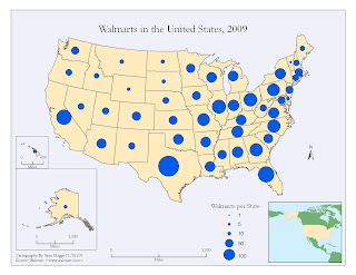
A Proportional Symbol map uses symbols of different sizes to represent data associated with the different areas on the map.
Above is an example of a Dot Density map depicting the number of Walmart stores per state in the United States in 2009. The larger the dot the larger the quantity of Walmart stores in that particular state.


No comments:
Post a Comment